
Annual income spent on food
(% OF HOUSEHOLD CONSUMPTIVE EXPENDITURES)
SOURCE: USDA/ECONOMIC RESEARCH SERVICE, 2008
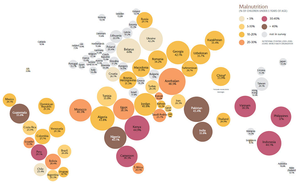
A map of the world based on food costs as a percentage of income compared with incidence of juvenile malnutrition.
The size of the country represents the percentage spent on food. The darker the color, the higher the rate of malnutrition.
World population growth
Illustration transcribed from the video “The Seventh Billion”—The Economist;
Data source: United Nations
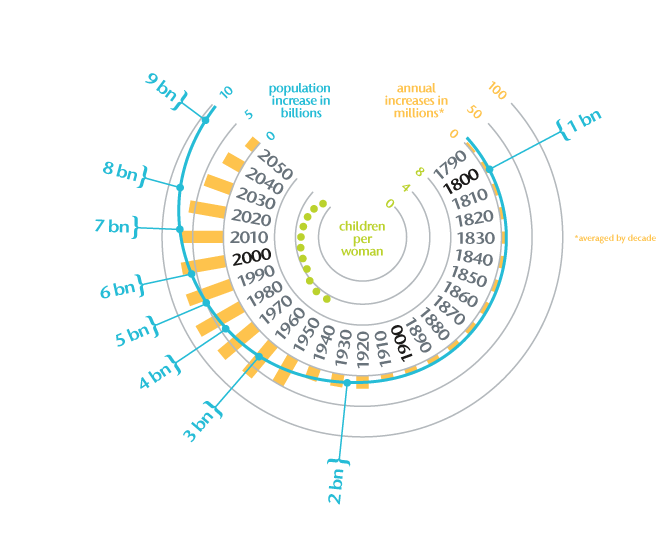
The first billion was the hardest. But starting in the 1950s, billions and billions more people arrived. As fertility rates decline, the world population could peak at 9 billion or so. But that’s 9 billion or so mouths to feed.
